In Denmark where I live sushi is very expensive. It really is a shame since it is my favorite food! Well, to be honest with you this is mostly to show that you to a large extent also can use Tableau to review your private economy.
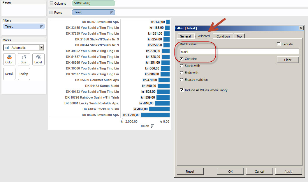
My bank allows me to export all transactions to an Excel file and I connected to this file in Tableau. I wanted to find all the lines that contain “sushi” in the Text field, so I right-clicked and selected Filter. I used the Wildcard Tab in the Filter dialog box to search for those lines:

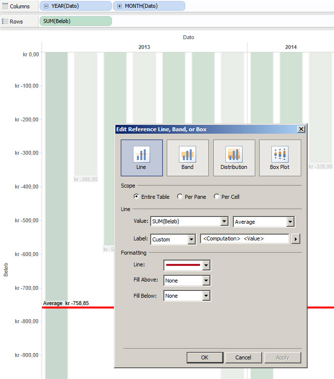
Then I created a new sheet because I wanted to see the amount spent on sushi per month. I wanted to see the average too, so I right-clicked on the axis and selected Add Reference Line, Band or Box to open the dialog box:

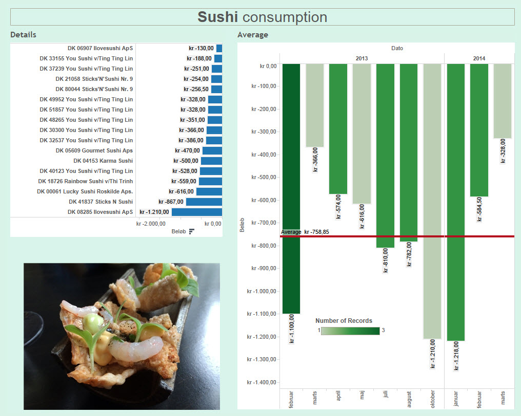
In less than 5 minutes I had built my dashboard:

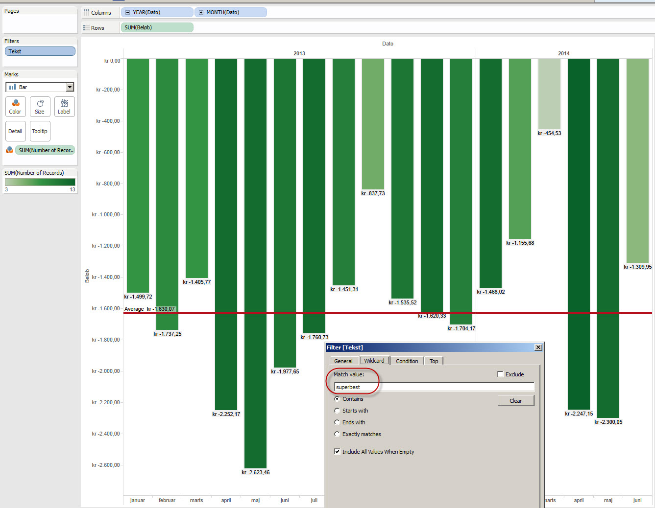
And if I change the filter using the local supermarket (Superbest), I have an instant overview of my spending here too:

Hej faster.
Den her sidde er super fed, men du spiser altså overdrevnt meget sushi…
Alt for meget sushi.
Kh.
Din sushi elskende nevø